Hi everyone! I'm Lella Cassa
Welcome on My Space
Hi everyone! I'm Lella Cassa
Welcome on My Space
Hi everyone! I'm Lella Cassa
Welcome on My Space

Download CV
I'm a Graphic Designer
I love turning ideas into visual experiences that are clear, engaging, and effective, combining creativity with usability. Explore my portfolio to discover some of the projects I’ve worked on over the years.
Download CV
I'm a Graphic Designer
I love turning ideas into visual experiences that are clear, engaging, and effective, combining creativity with usability. Explore my portfolio to discover some of the projects I’ve worked on over the years.
Download CV
I'm a Graphic Designer
I love turning ideas into visual experiences that are clear, engaging, and effective, combining creativity with usability. Explore my portfolio to discover some of the projects I’ve worked on over the years.
Website Redesign - Alp Ice
Alp Ice is a premium ice brand that is part of Gruppo Frisia, based in Valchiavenna.
The product is made from alpine spring water with an extremely low fixed residue, free of impurities, which results in perfectly crystalline ice pieces. The products target the HoReCa B2B segment, with a positioning in the high-end market.

The visual identity draws on Art Déco aesthetics and Gatsby imagery, built on symmetry, ornamentation, and cinematic luxury. The palette centers on gold and petrol blue. Typography combines Goldenbook for headings, a serif inspired by a 1920s literary magazine with an Art Déco lens, and Halyard Display for body text, a sans-serif echoing contemporary luxury.

Before the redesign, palette, fonts, and Art Déco ornamental system were all present in the brand brief. The issue was not identity but systemic coherence. Colours lacked hierarchy, the hero failed to communicate the product, and category pages did not guide buyers toward conversion. The redesign built the rules for that visual language, turning isolated elements into a unified system.
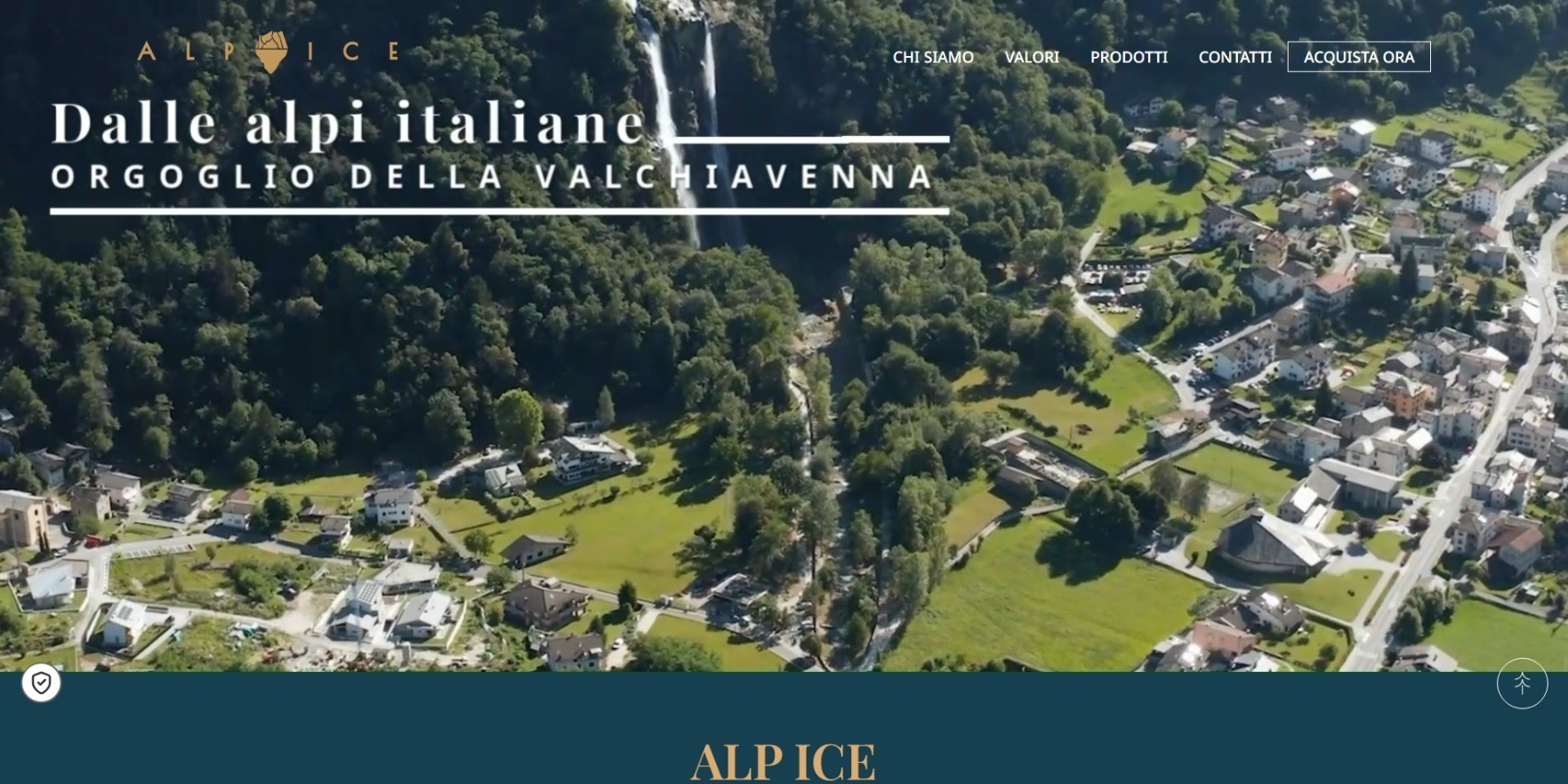
The old hero opened with an aerial Alps video, on-brand but emotionally distant from the drink and indistinguishable from other mountain brands.
The new hero is a full-screen photograph of a premium cocktail with ice as the visual protagonist. The claim splits the frame, creating a cinematic composition.

A looping video was added to support the static image, showing the ice in motion, catching and refracting light. The choice was conceptual, not aesthetic, because ice lives in movement.
A still photo captures formal perfection, but only video captures the product's sensory life. In a brand that sells experience before ingredient, that difference matters.The old website already used gold and petrol blue, but without any logic of hierarchy. Petrol blue dominated the background, reducing gold to a secondary decorative role. A palette compressed into a single dark tone removes breathing room from the layout and leaves no space for photography to shine, a contradiction for a brand defined as "Crafted to be Photographed".
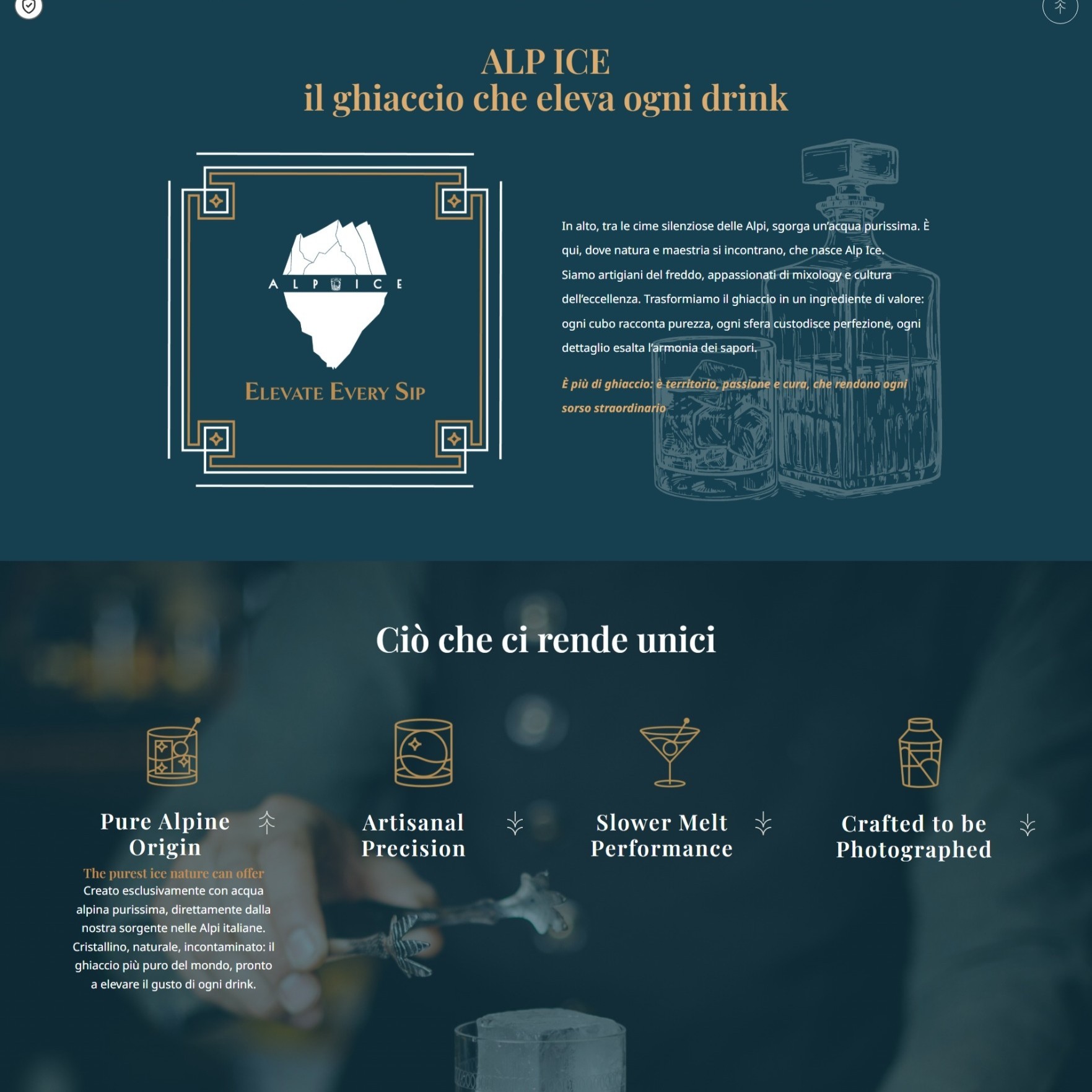
The most impactful decision was inverting the relationship between background and accent.
The new site uses white as the dominant background, petrol blue is reserved for sections of high narrative intensity, like the navigation bar and footer, while gold becomes the primary accent of active elements, headings, dividers, ornaments, and highlights.
A predominantly light site with golden accents evokes editorial luxury, whereas a dark site risks sliding toward a aesthetic far from the refined positioning of Alp Ice. The golden geometric frames are not casual decorations, they form a recurring visual system, with the same proportions, and line weights carried through every section of the site, dividers, hero frames, and product cards.
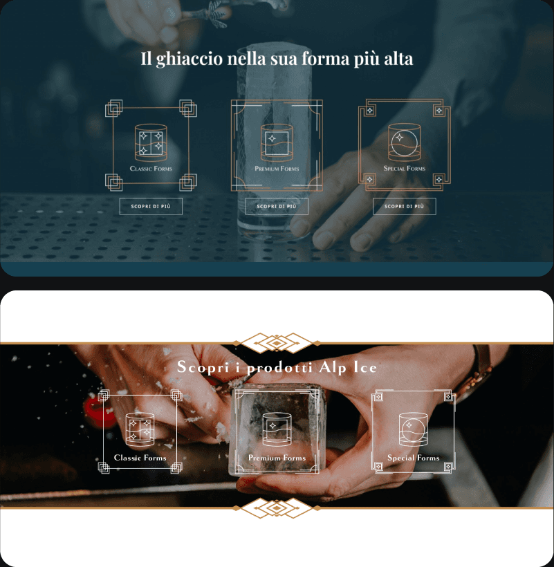
The individual line pages listed products, Classic form, Premium form and Special form, without guiding the buyer. Technical specifications such as dimensions, weight, and units per bag and per carton were hidden behind a click, rather than being presented as immediately accessible data for anyone planning orders. The clientele of international hotels and palaces was entirely invisible.

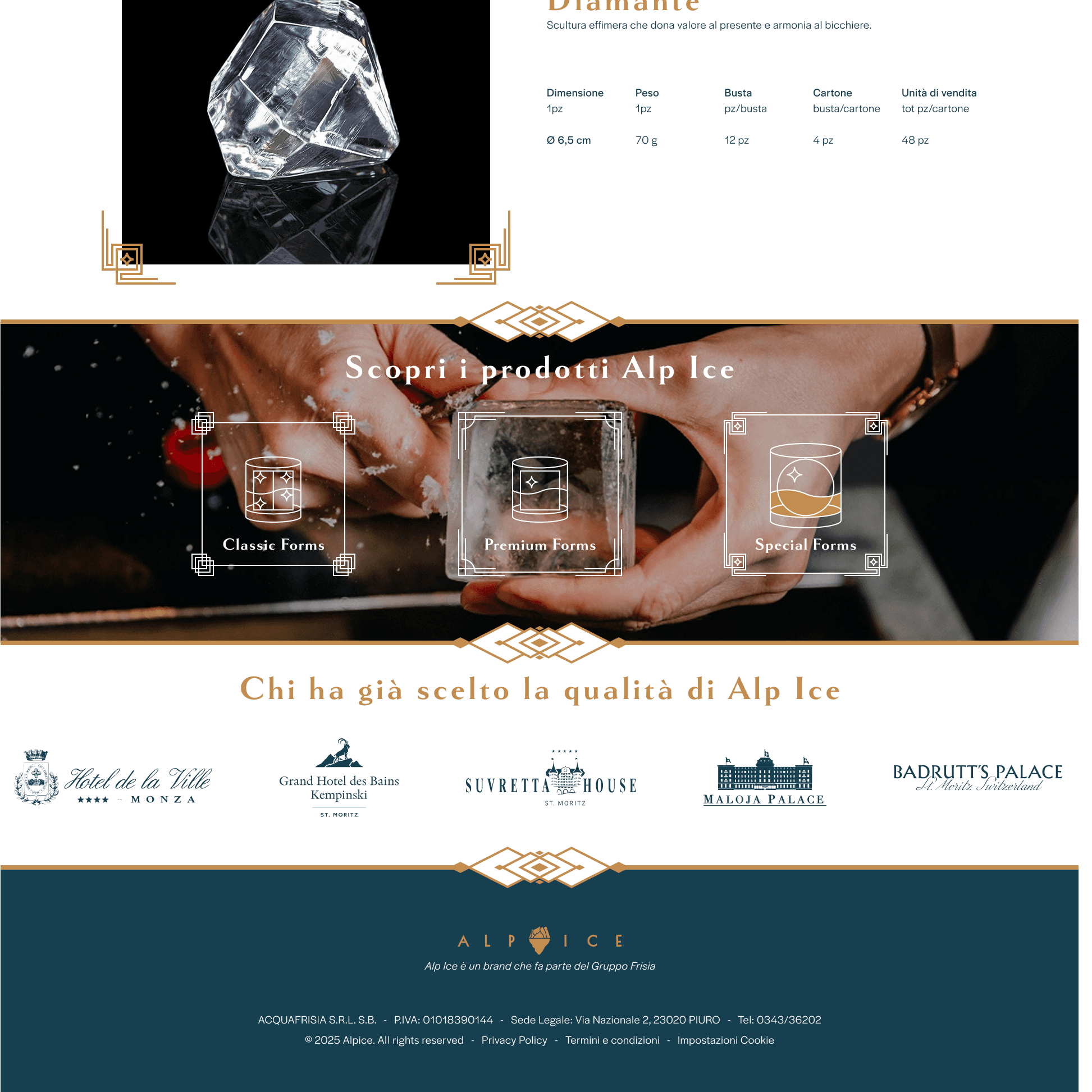
The redesign rethought every category page around a dedicated cinematic hero, consistent with the homepage, creating recognisability and visual system across sections. Product sheets now include an elegant technical table, data presented with clean typography that, rather than diminishing the luxury feel, enhances it by communicating precision and professional.

The "Who Has Already Chosen Alp Ice Quality" section, a carousel of luxury client logos, is the most strategically relevant additions. In the premium B2B market, social proof is a mechanism for reducing perceived risk. Every buyer evaluating a new supplier wants to see who else has already made that choice, lowering perceived risk immediately, resolving the main objection before it is even raised.
The redesign was built around precise business objectives.
The HoReCa buyer who visits the site needs to know whether the product is of adequate quality, whether other players in the sector use it, and whether the technical specifications are accessible for planning orders. The new site answers all three questions within the first scroll.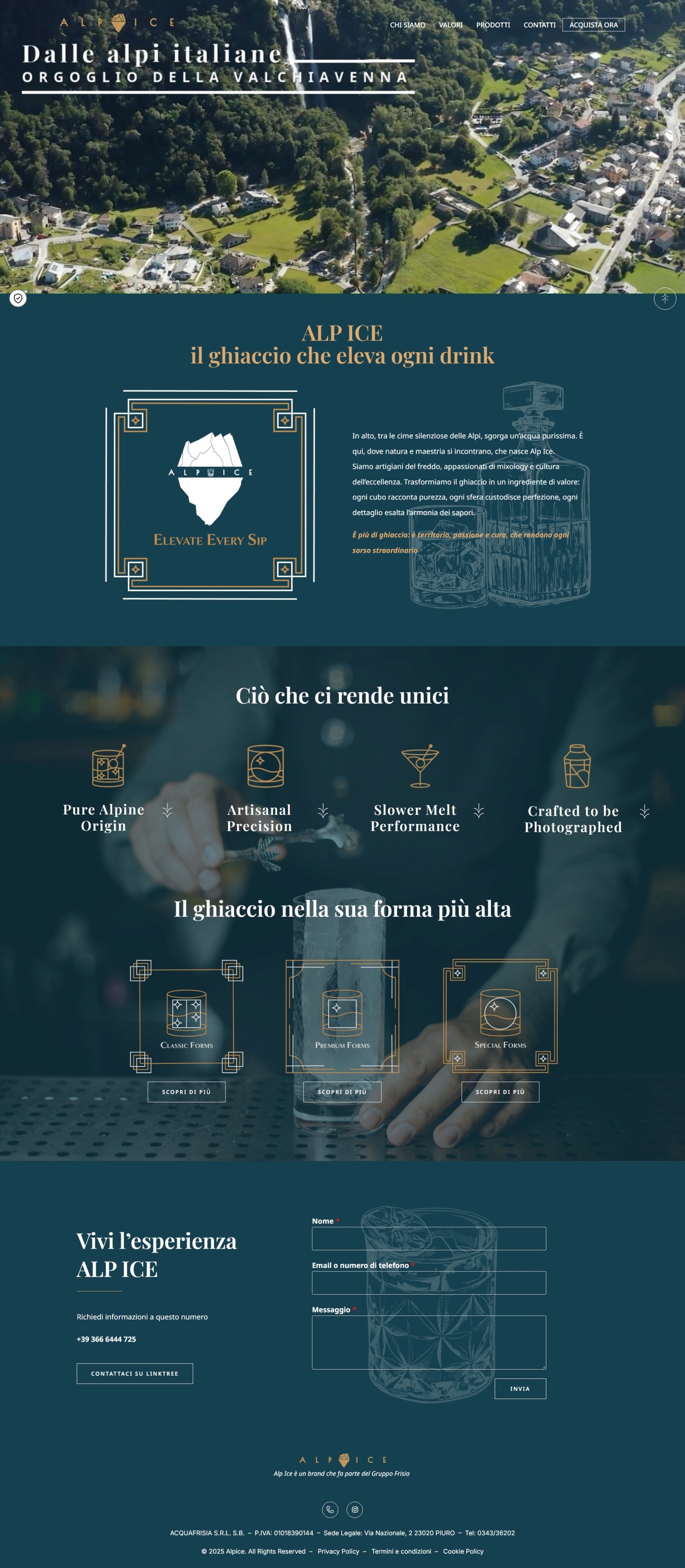

Fluid navigation between categories and visual coherence transform the visit from simple information search into a brand experience, increasing time on site and reducing bounce rate.
In terms of perceived positioning, a site that aesthetically competes with the world's finest hotels raises the threshold of acceptable price, because luxury is perceived visually before anything else.


Website Redesign - Alp Ice
Alp Ice is a premium ice brand that is part of Gruppo Frisia, based in Valchiavenna.
The product is made from alpine spring water with an extremely low fixed residue, free of impurities, which results in perfectly crystalline ice pieces. The products target the HoReCa B2B segment, with a positioning in the high-end market.
Website Redesign - Alp Ice
Alp Ice is a premium ice brand that is part of Gruppo Frisia, based in Valchiavenna.
The product is made from alpine spring water with an extremely low fixed residue, free of impurities, which results in perfectly crystalline ice pieces. The products target the HoReCa B2B segment, with a positioning in the high-end market.
Show more
Show more
Brand Identity - Odontologist
The project was developed to create a strong and memorable visual identity for Dr. Sara Ruffino, helping her stand out in today's market, where image and recognizability are increasingly important. The logo, being the first element noticed by the public, must be designed to capture attention and convey the brand's core values quickly and naturally.
Brand Identity - Odontologist
The project was developed to create a strong and memorable visual identity for Dr. Sara Ruffino, helping her stand out in today's market, where image and recognizability are increasingly important. The logo, being the first element noticed by the public, must be designed to capture attention and convey the brand's core values quickly and naturally.
Show more
Show more
Packaging - Novi Chocolate
The project is based on developing a new image for Novi through the redesign of the logo and the creation of two packaging variants aimed at audiences with different needs and sensibilities. This dual packaging strategy allows Novi to position itself across different consumer segments, expanding its appeal as both a traditional and innovative chocolate maker.
Packaging - Novi Chocolate
The project is based on developing a new image for Novi through the redesign of the logo and the creation of two packaging variants aimed at audiences with different needs and sensibilities. This dual packaging strategy allows Novi to position itself across different consumer segments, expanding its appeal as both a traditional and innovative chocolate maker.
Show more
Show more
App delivery - Bissinbox
The project aims to create a strong and recognizable visual identity, with a particular focus on its digital applications, in order to position the brand competitively within food delivery sector. Beyond establishing a distinctive look, the goal is to design a cohesive system that communicates trust, innovation, and accessibility across every touchpoint.
App delivery - Bissinbox
The project aims to create a strong and recognizable visual identity, with a particular focus on its digital applications, in order to position the brand competitively within food delivery sector. Beyond establishing a distinctive look, the goal is to design a cohesive system that communicates trust, innovation, and accessibility across every touchpoint.

Show more
Show more
Commercial spot - Controller
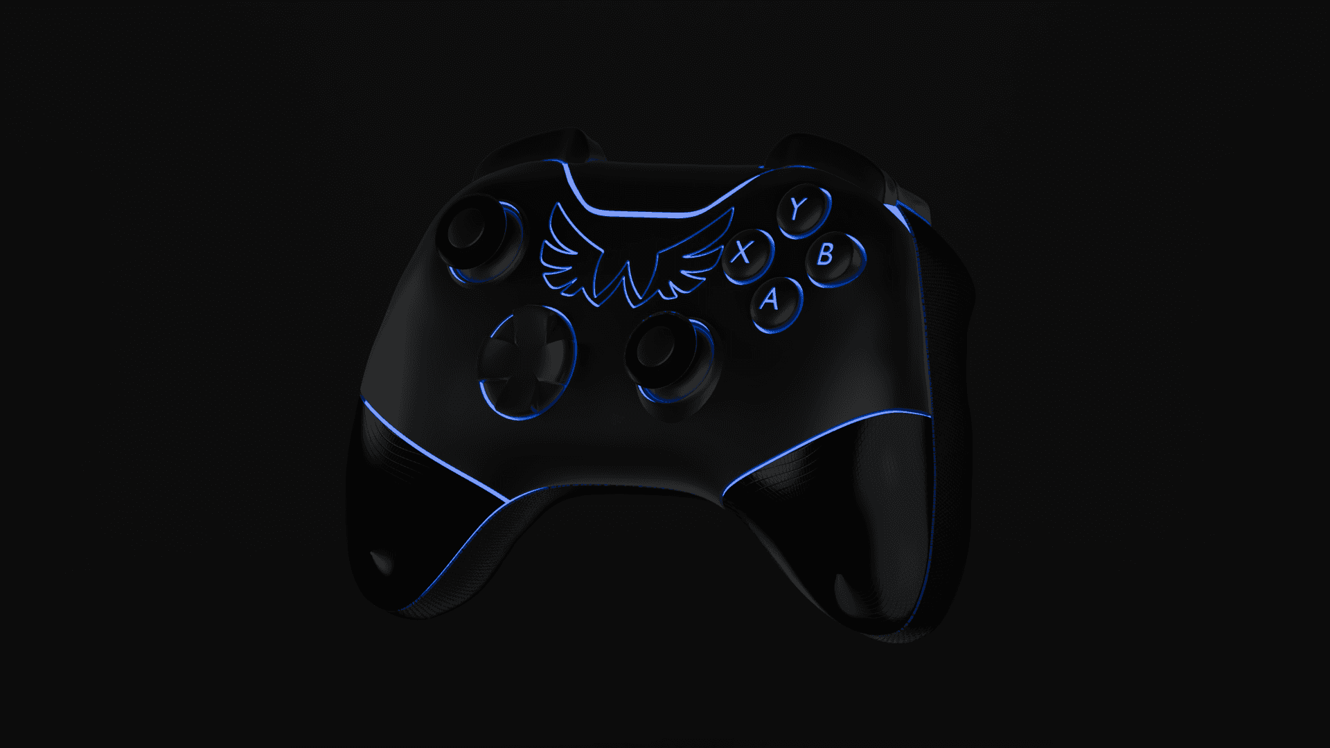
The project aimed to create a commercial spot dedicated to a limited-edition controller. The product design integrates the videogame’s logo directly onto the shell, turning it into a distinctive feature. The spot was conceived to highlight every aesthetic and functional detail of the controller, showcasing its build quality and visual impact.
Commercial spot - Controller
The project aimed to create a commercial spot dedicated to a limited-edition controller. The product design integrates the videogame’s logo directly onto the shell, turning it into a distinctive feature. The spot was conceived to highlight every aesthetic and functional detail of the controller, showcasing its build quality and visual impact.
Show more
Show more
Packaging - Novi Chocolate
The project is based on developing a new image for Novi through the redesign of the logo and the creation of two packaging variants aimed at audiences with different needs and sensibilities. This dual packaging strategy allows Novi to position itself across different consumer segments, expanding its appeal as both a traditional and innovative chocolate maker.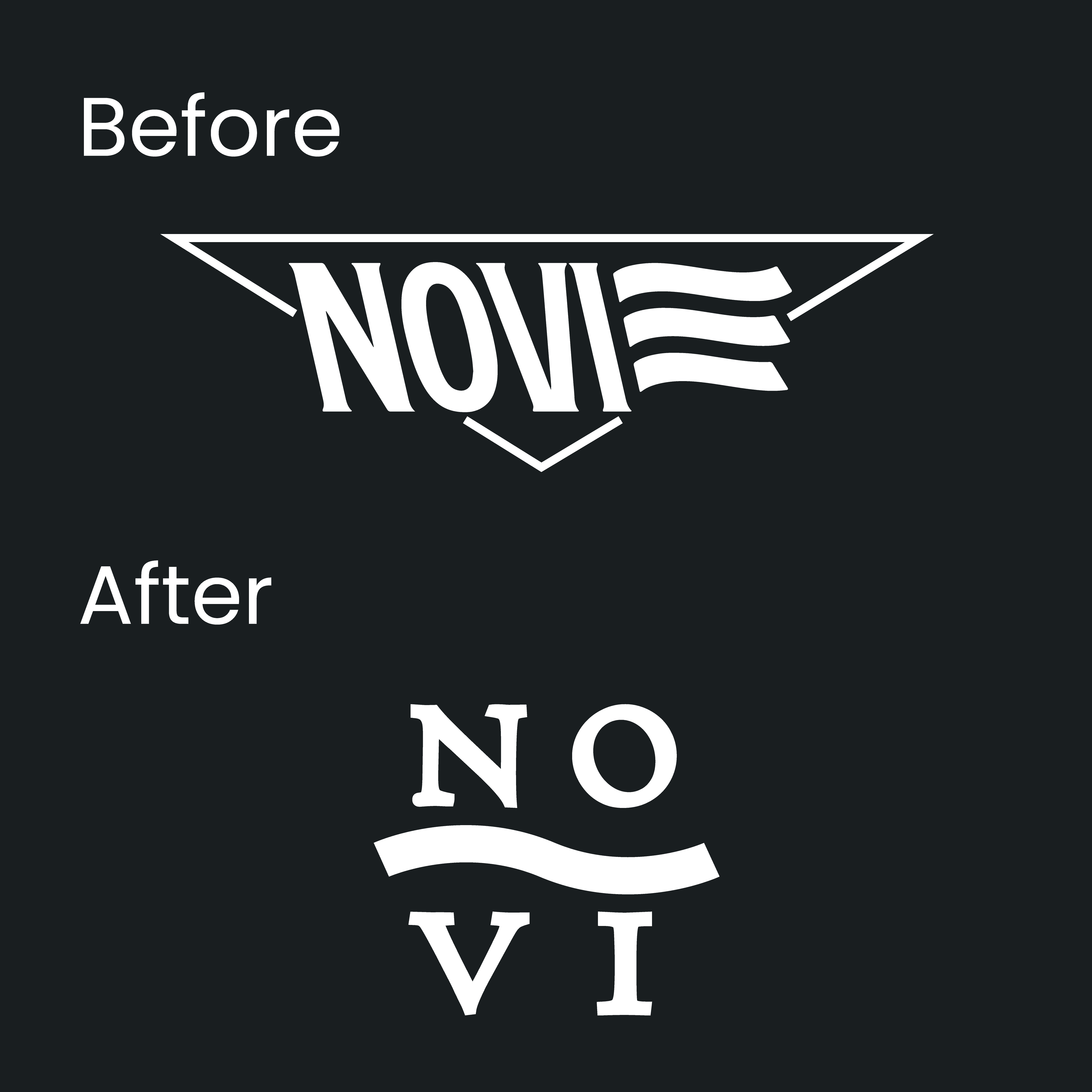
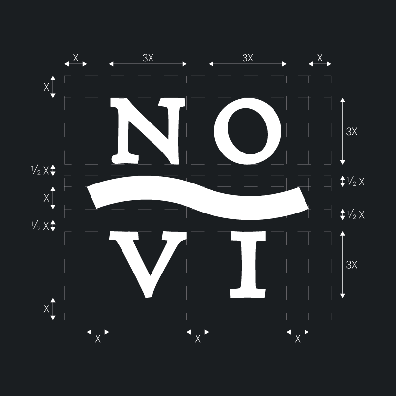
The logo has been reinterpreted while preserving its connection to tradition, but with a lighter design to make it more contemporary and versatile. The use of a serif typeface with soft, humanistic lines recalls typographic craftsmanship. The three bands of the historic logo have been stylized into a single graphic element, maintaining recognizability, also suitable for engravings and compact formats.
The gourmet line targets a curious audience, passionate about culinary culture and eager to explore new flavors through original and refined pairings.
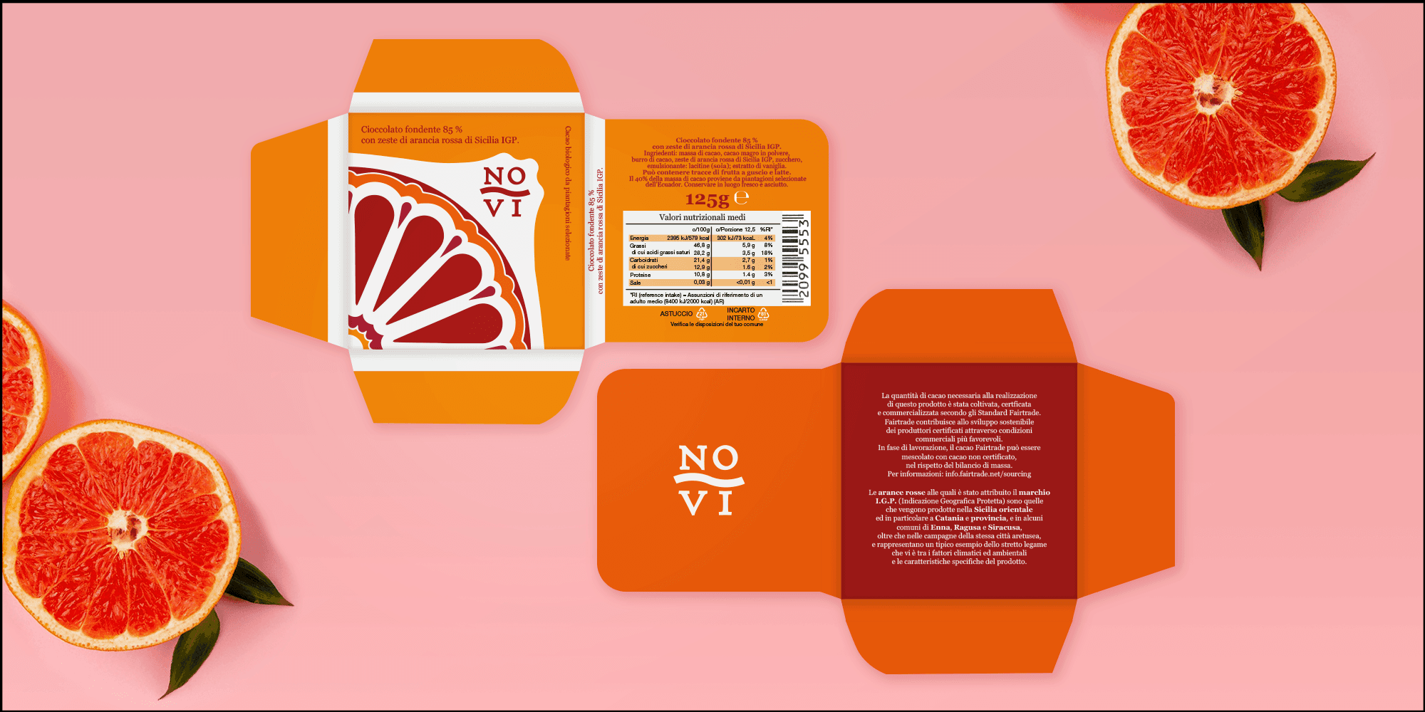
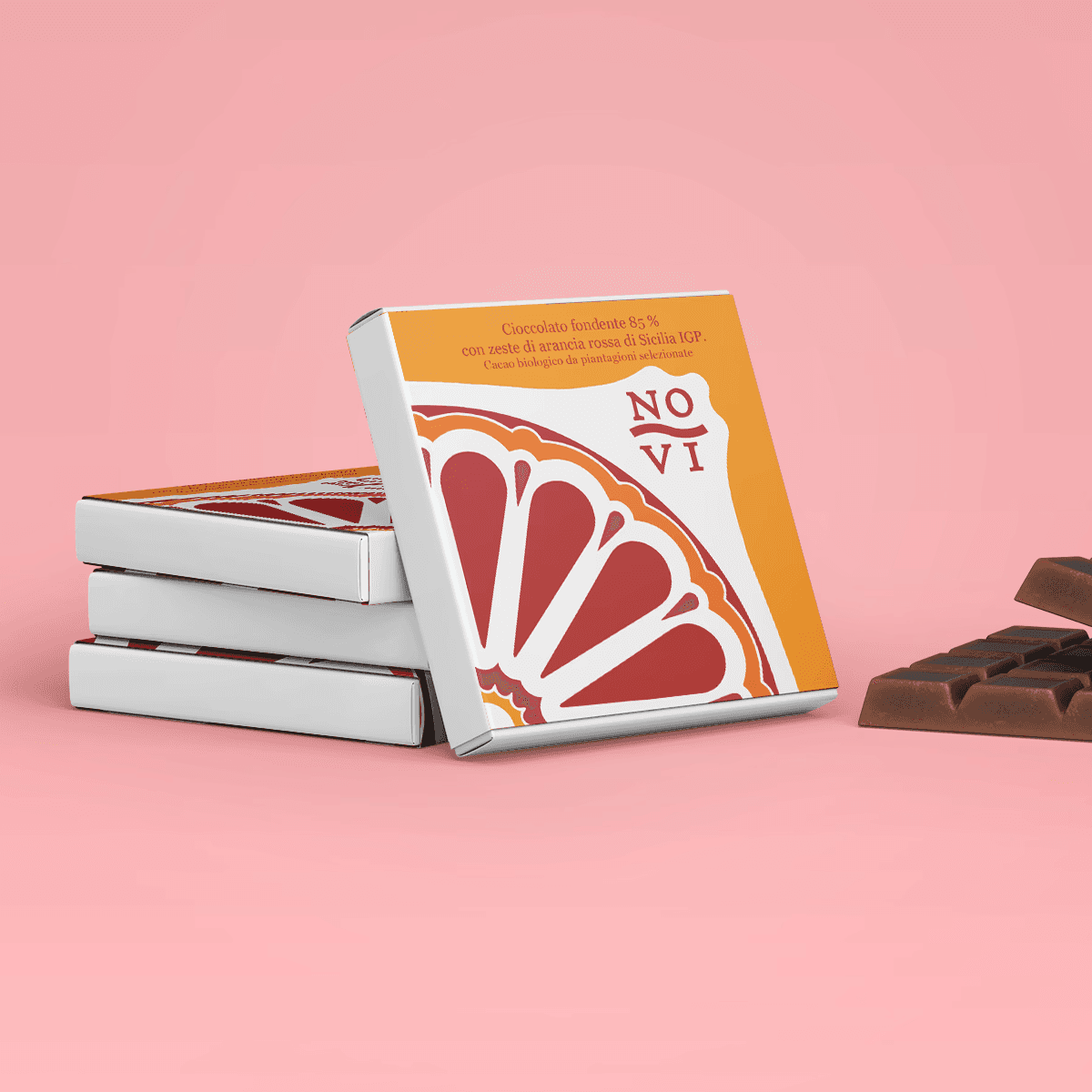
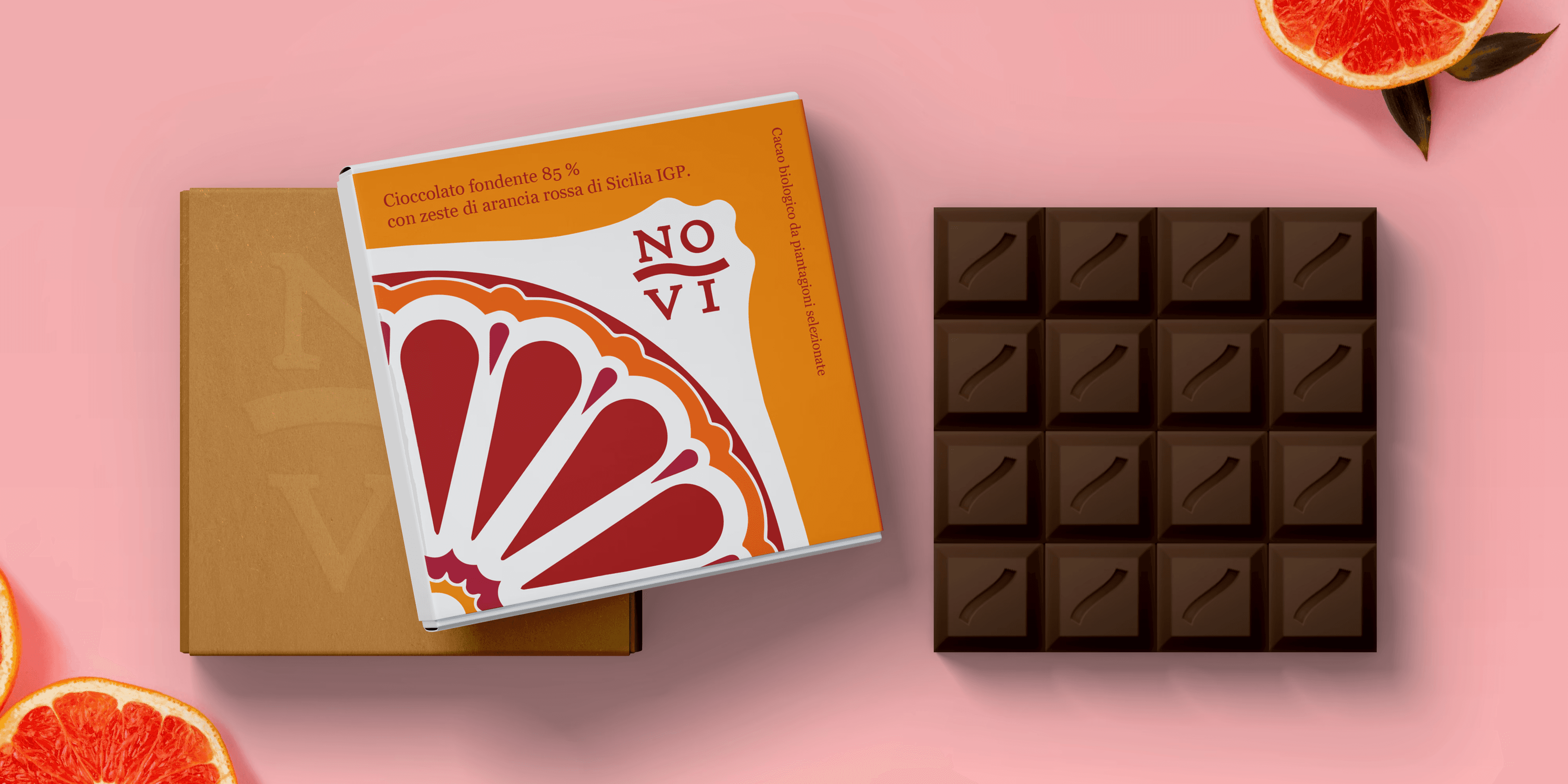
The packaging was designed to appear refined and modern, with a strong visual identity connected to the region. The design recalls Sicilian majolica tiles, reinterpreted in a contemporary key. The decoration, inspired by the cross-section of a blood orange, becomes a modular pattern: when multiple packages are placed side by side, they reconstruct the complete image, creating a strong visual impact.

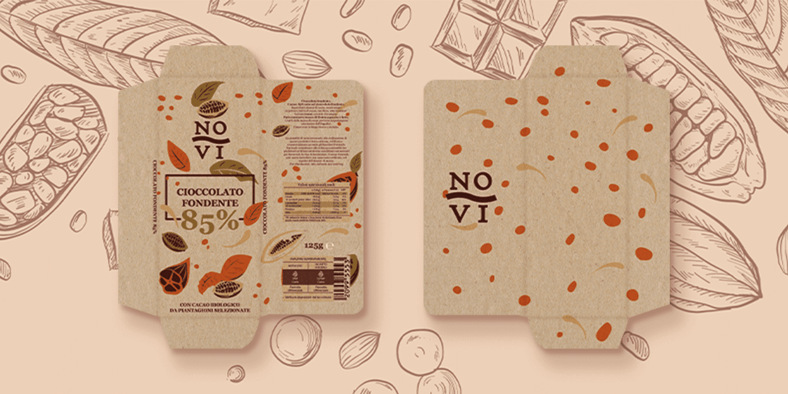
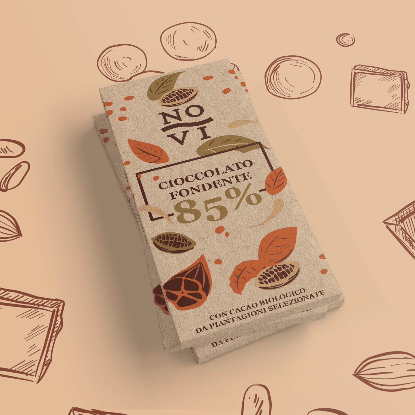
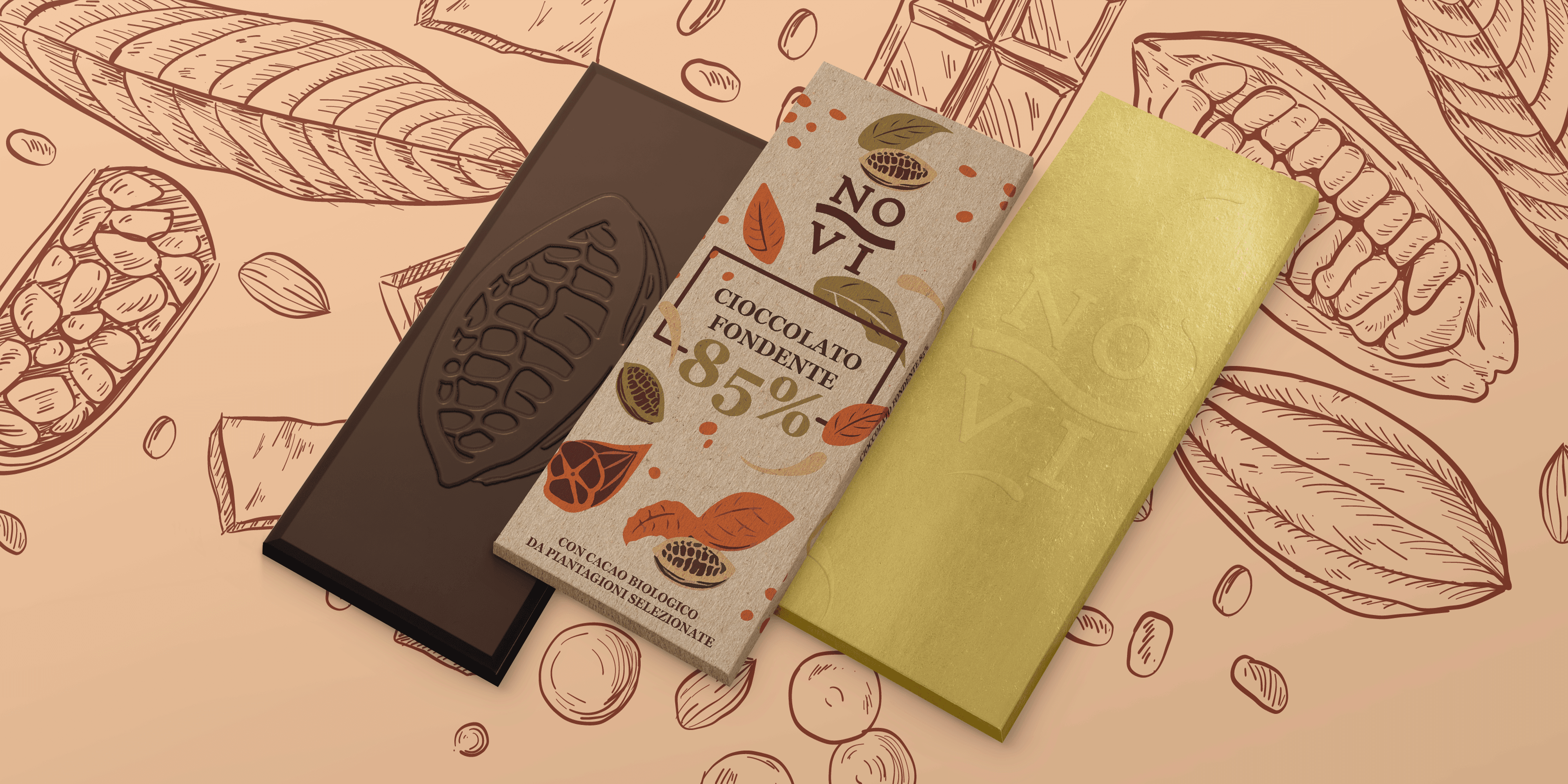
The artisanal line, aimed at an audience attentive to product quality and sustainability, is distinguished by the use of kraft paper and natural inks.
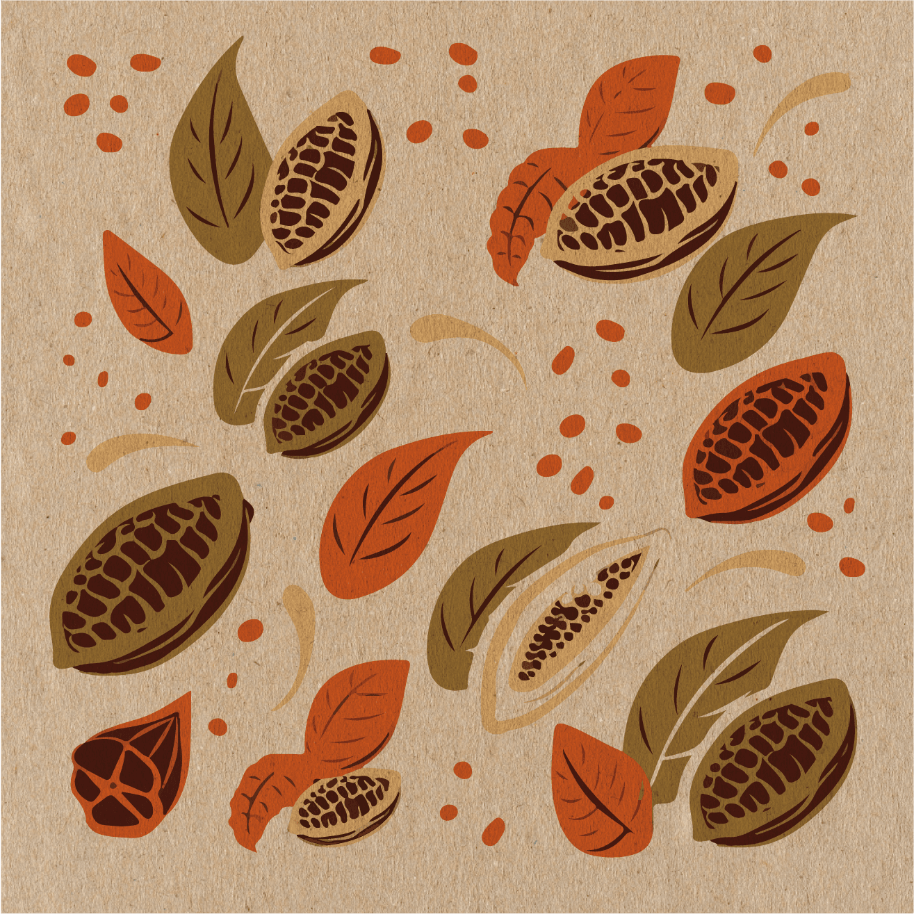
The graphics depict stylized cocoa pods in soft tones that perfectly harmonize with the recycled paper, enhancing its appeal and reinforcing the product’s niche identity rooted in craftsmanship and sustainability. The bar forgoes the traditional division and instead features a relief in the shape of a pod; breaking it thus becomes part of the sensory experience, allowing consumers to interact in a tactile and engaging way.
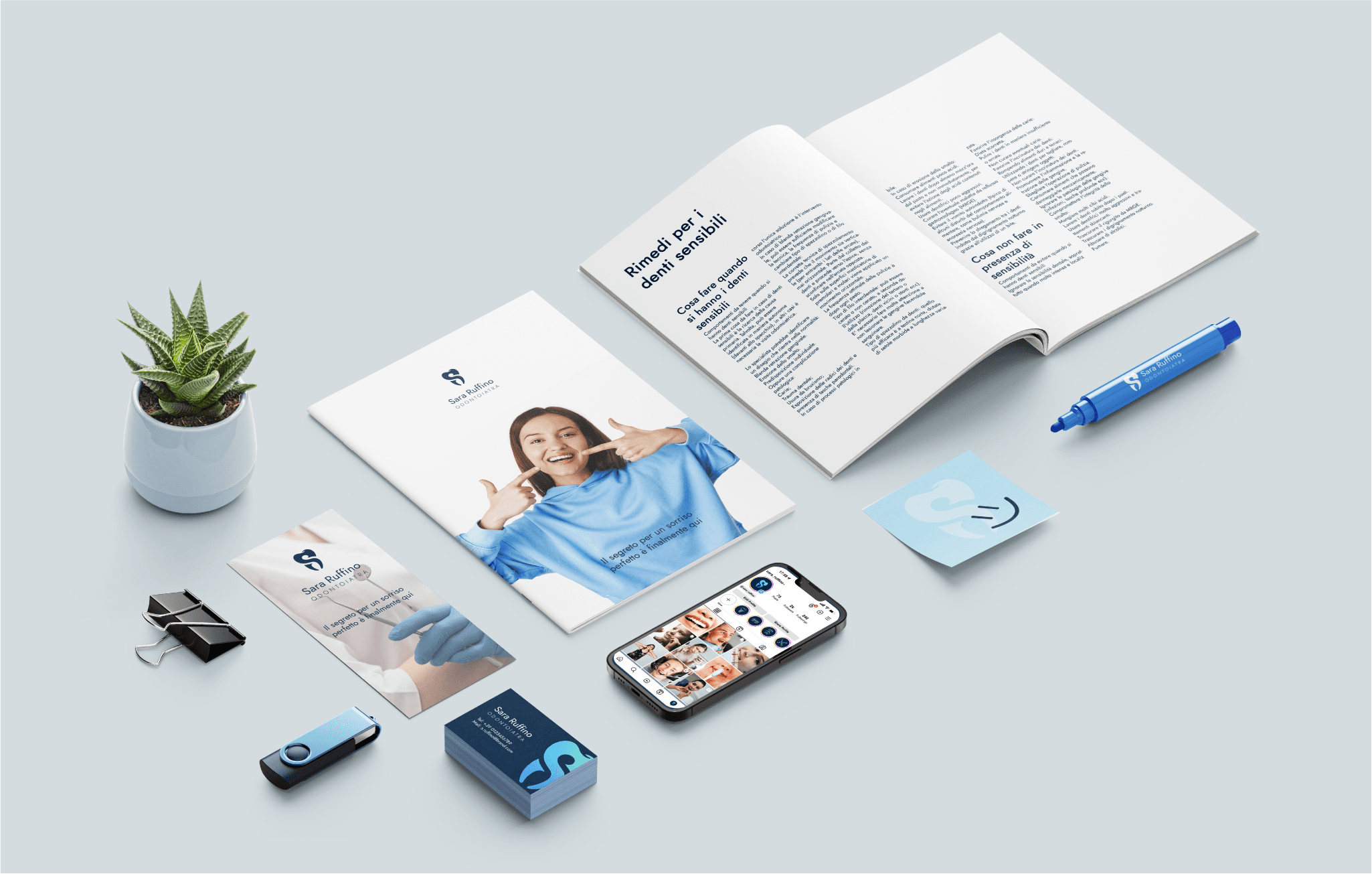
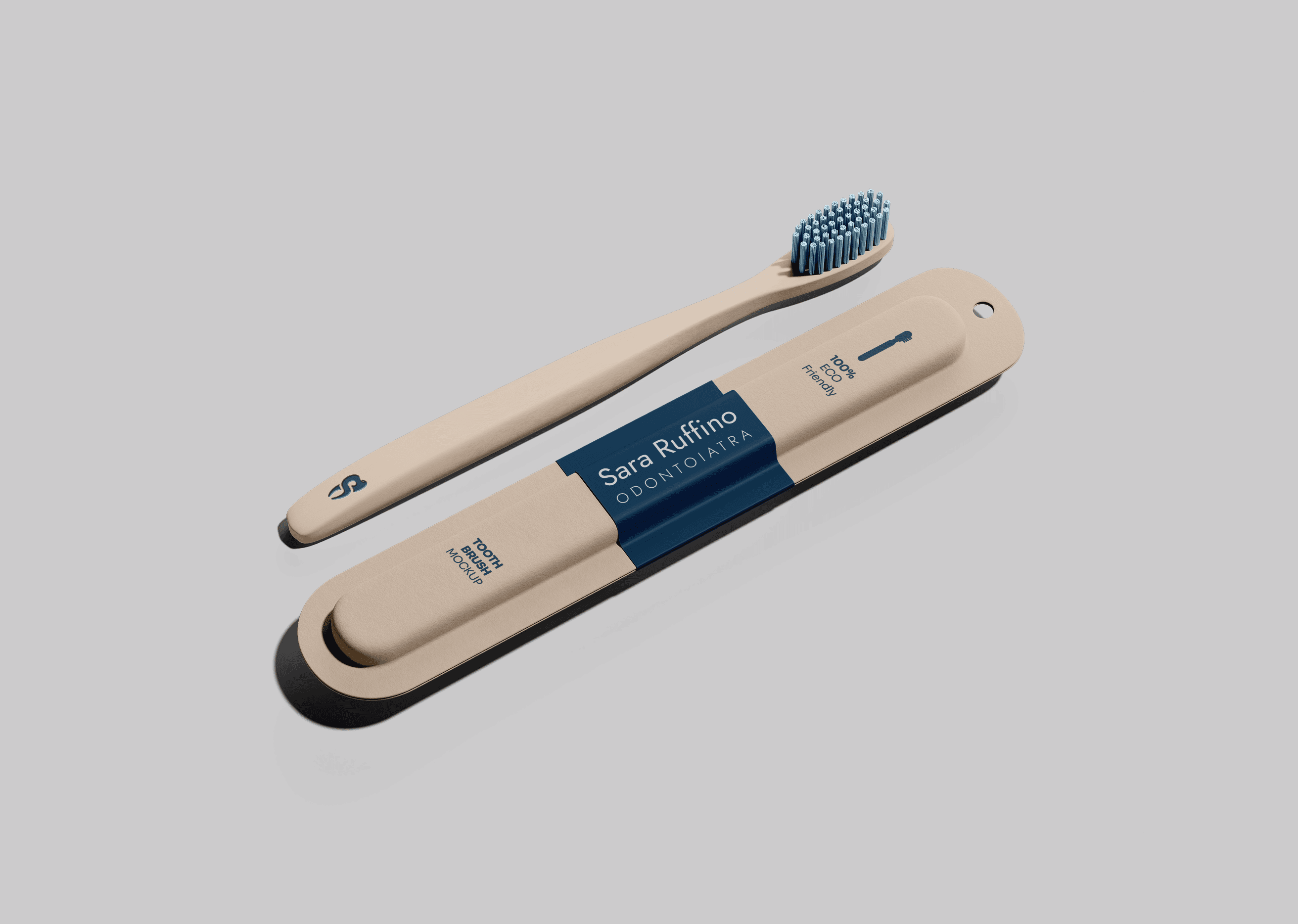
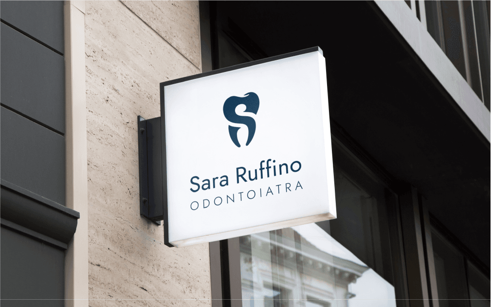
Brand Identity - Odontologist
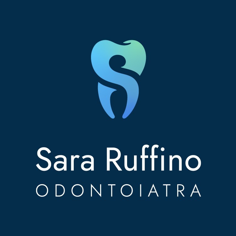
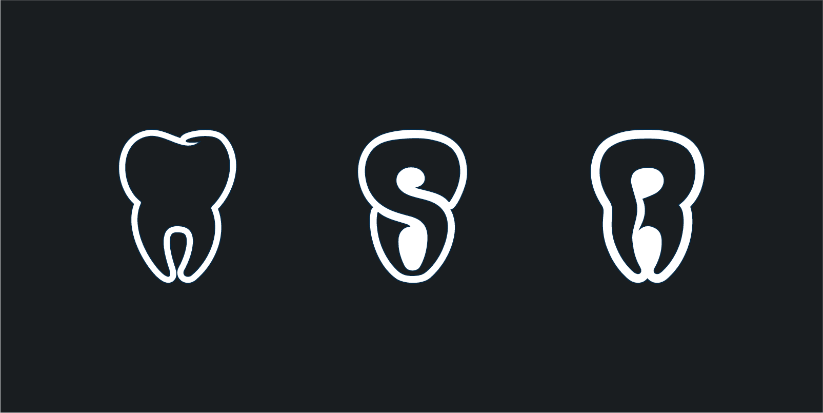
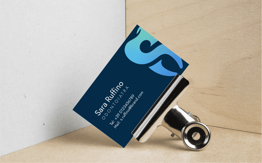
The project was developed to create a strong and memorable visual identity for Dr. Sara Ruffino, helping her stand out in today's market, where image and recognizability are increasingly important. The logo, being the first element noticed by the public, must be designed to capture attention and convey the brand's core values quickly and naturally.The logo was created by merging the initials “S” and “R” into a pictogram recalling the silhouette of a tooth: a simple, versatile, and instantly recognizable graphic sign.
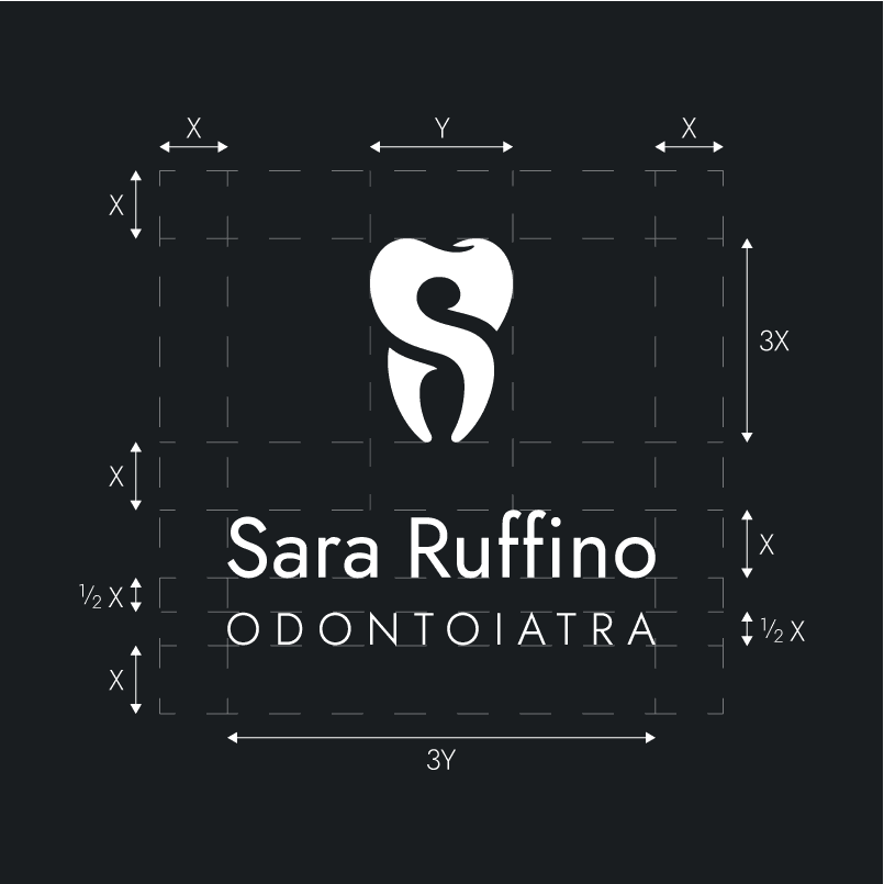
The logo’s construction is based on a modular system that uses constant measurements. The system calibrates the logo’s width and spacing using X and Y units for consistent proportions. This configuration ensures that the logo, in all its variations, always maintains visual consistency, enhancing the graphic sign and guaranteeing maximum readability and recognizability.
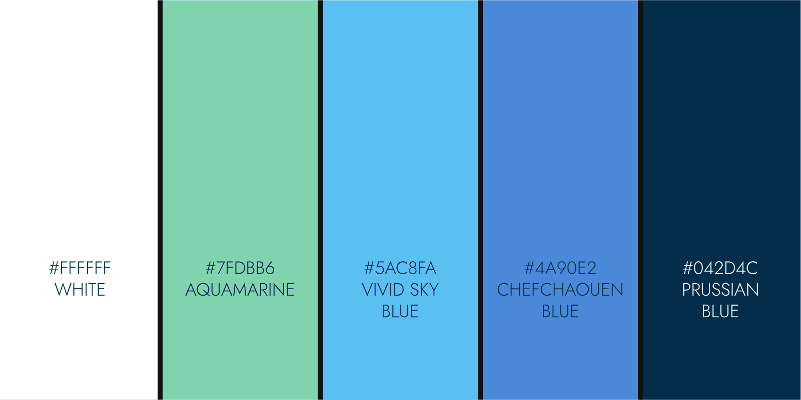
The color palette combines white, aquamarine, vivid sky blue, chefchaouen blue, and Prussian blue, evoking freshness, reliability, and authority.
App delivery - Bissinbox
The project aims to create a strong and recognizable visual identity, with a particular focus on its digital applications, in order to position the brand competitively within food delivery sector. Beyond establishing a distinctive look, the goal is to design a cohesive system that communicates trust, innovation, and accessibility across every touchpoint.
"Bissinbox" was created to blend the joy of food with the ease of convenience. The word "Biss" in German means "bite", while in Latin-derived languages it recalls "bis", something so good that you want it again. "Box" evokes the practical food delivery container, symbolizing speed and practicality. "Biss in Box" is an invitation to enjoy another bite, another experience, another moment of taste.
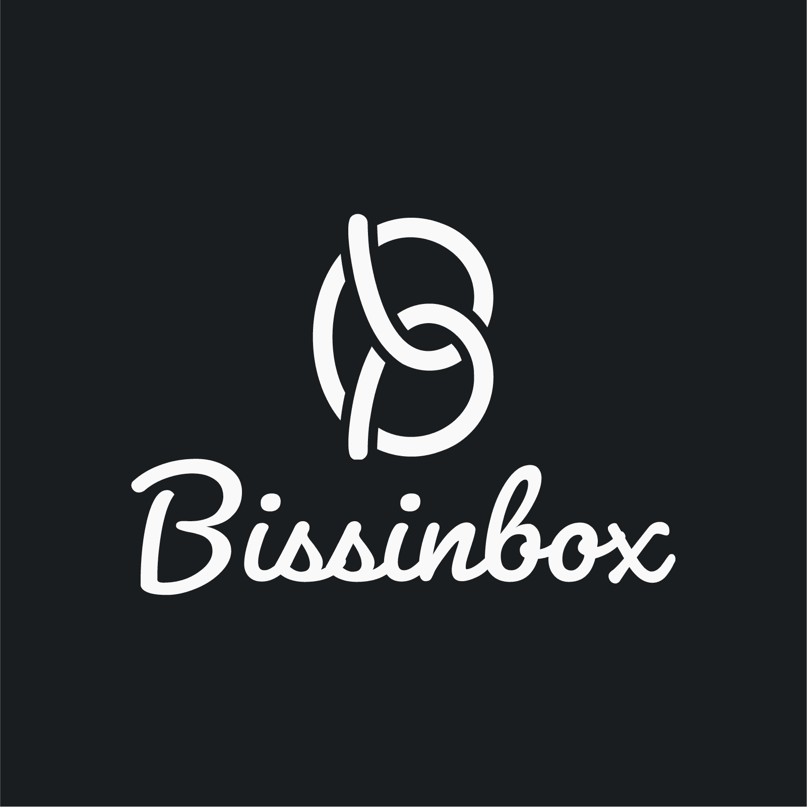
The Bissinbox logo features a stylized pretzel, arranged to visually form the letter B. Its clean and simple design establishes a strong and easily recognizable visual identity for the brand. At the same time, the logo's versatility ensures it can be effectively applied across a wide range of platforms, marketing materials, and packaging, making it a consistent and memorable symbol of the brand's identity.
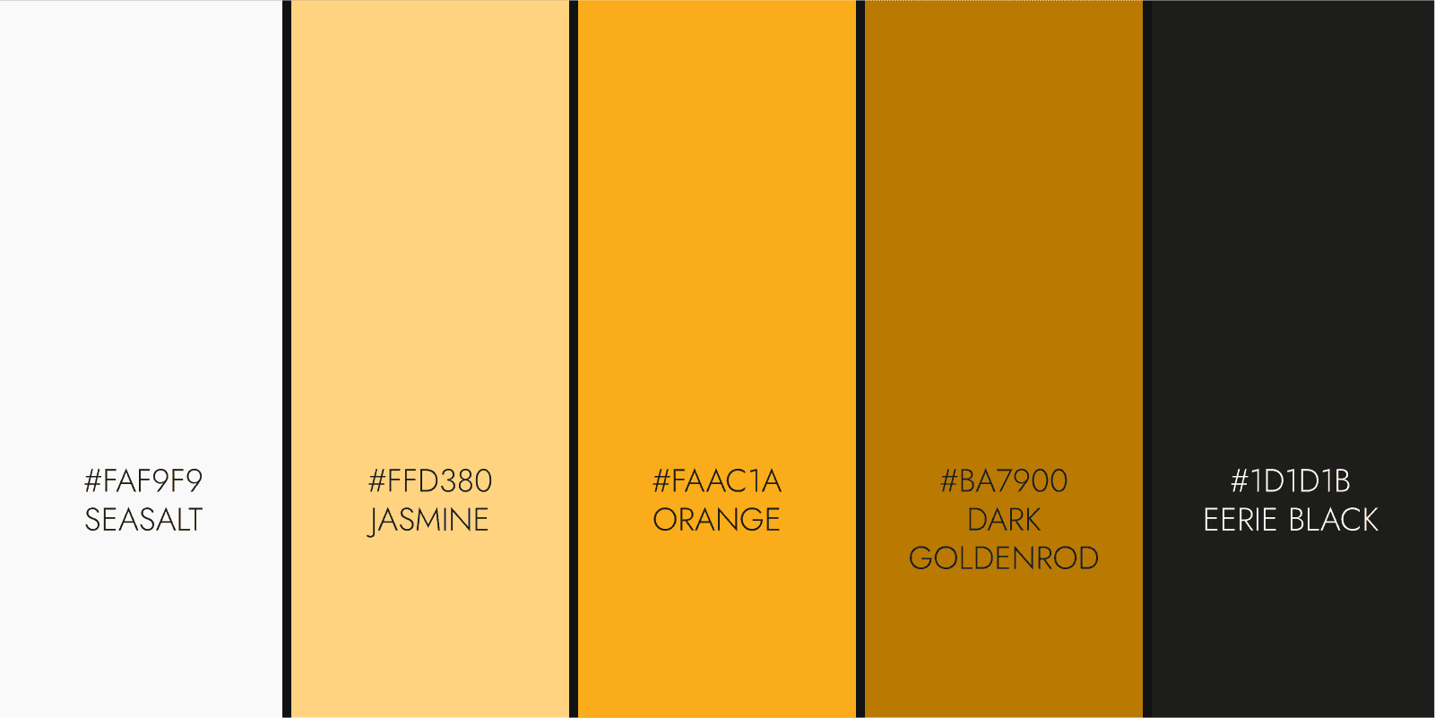
Colors were chosen to guide users through key actions and navigation points. Each shade was carefully applied to all interactive elements to ensure maximum clarity.
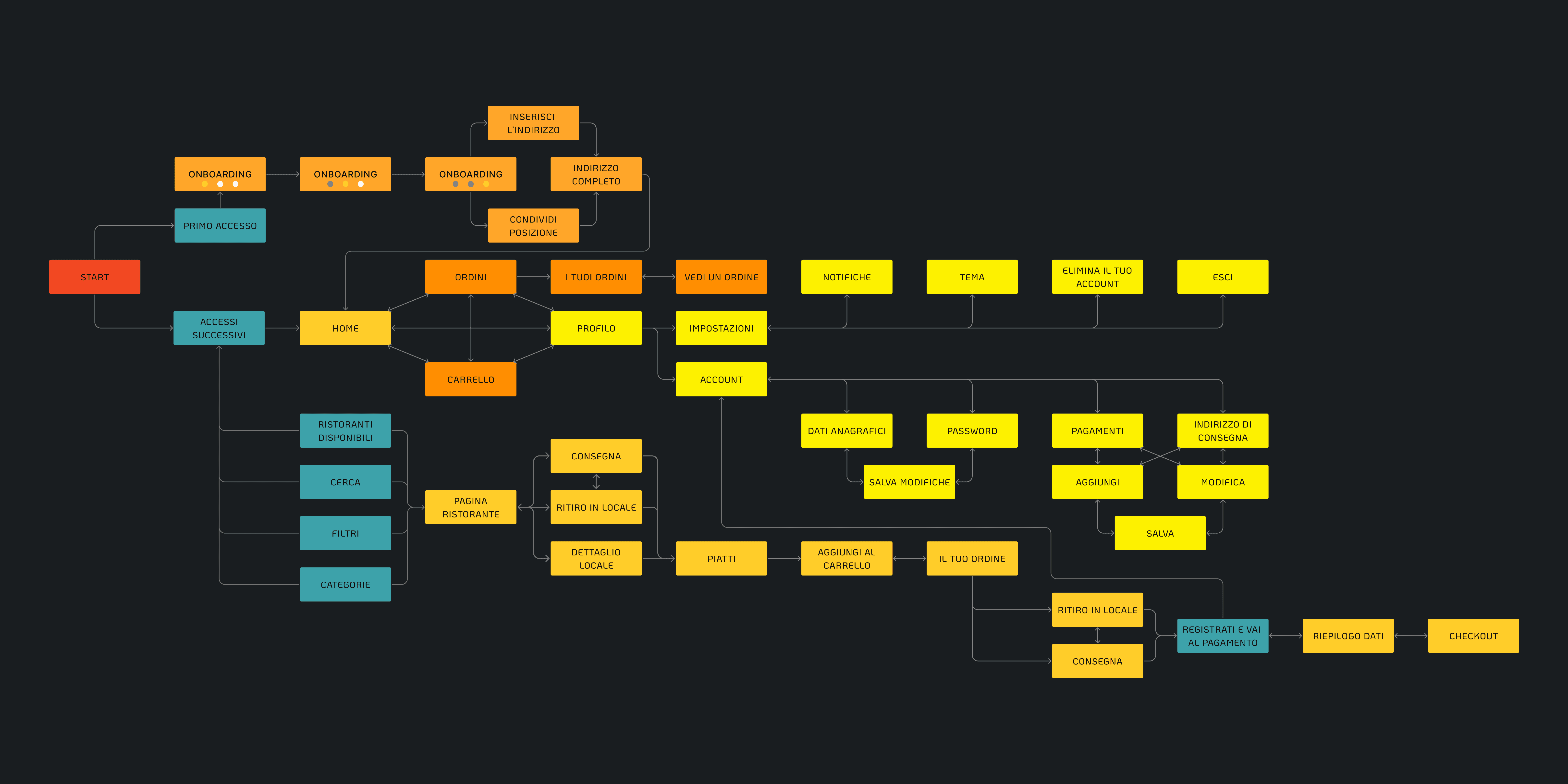
The user flow maps the full journey from onboarding to managing orders and settings, ensuring simple navigation and an intuitive, consistent experience.
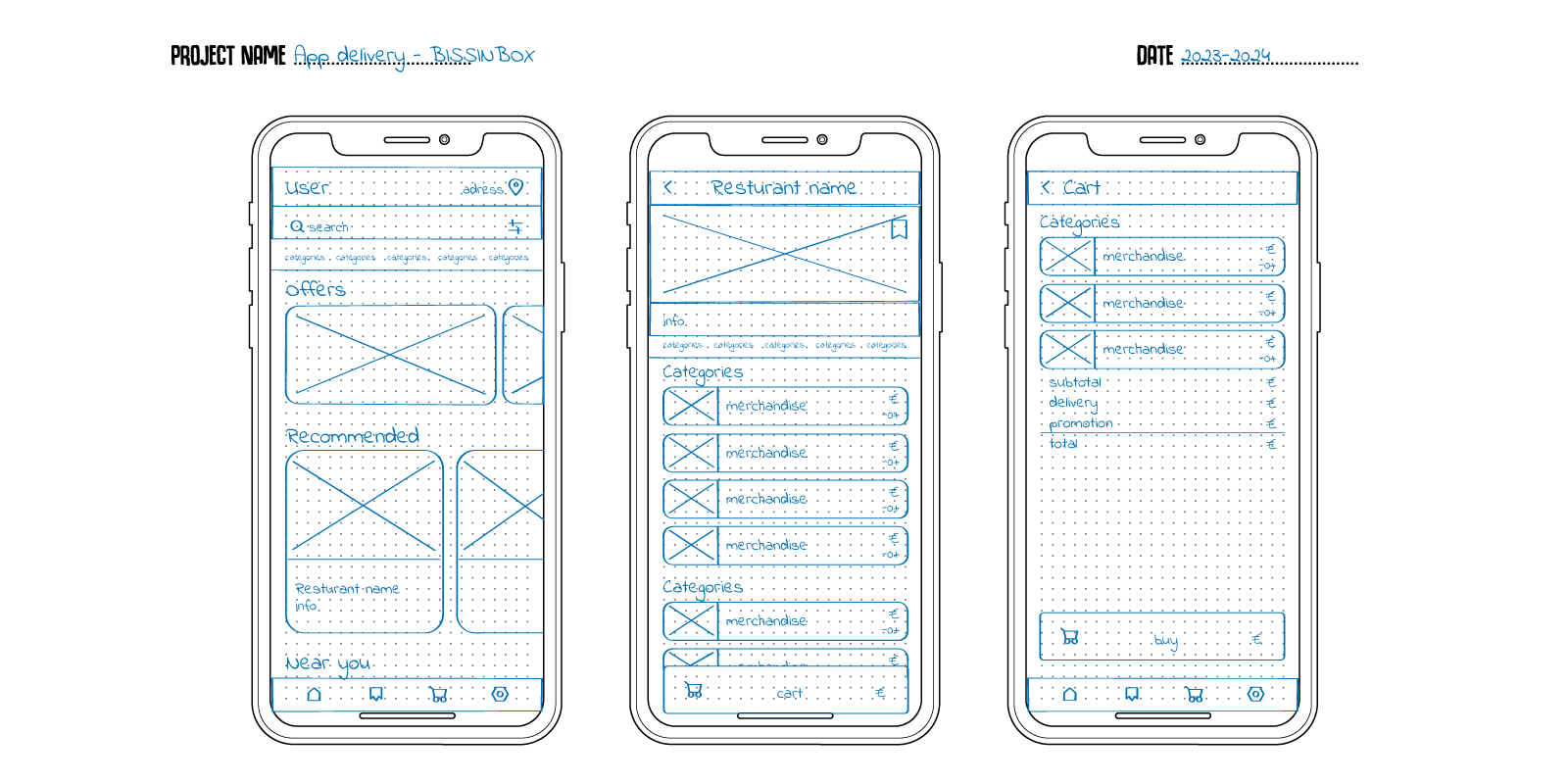
Wireframes represent the first visual translation of the app’s structure. In these sketches, page content is organized to outline a consistent layout throughout the app.
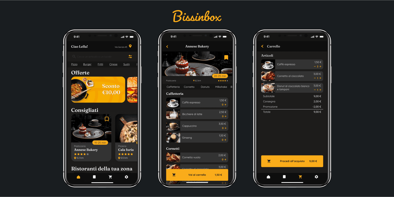
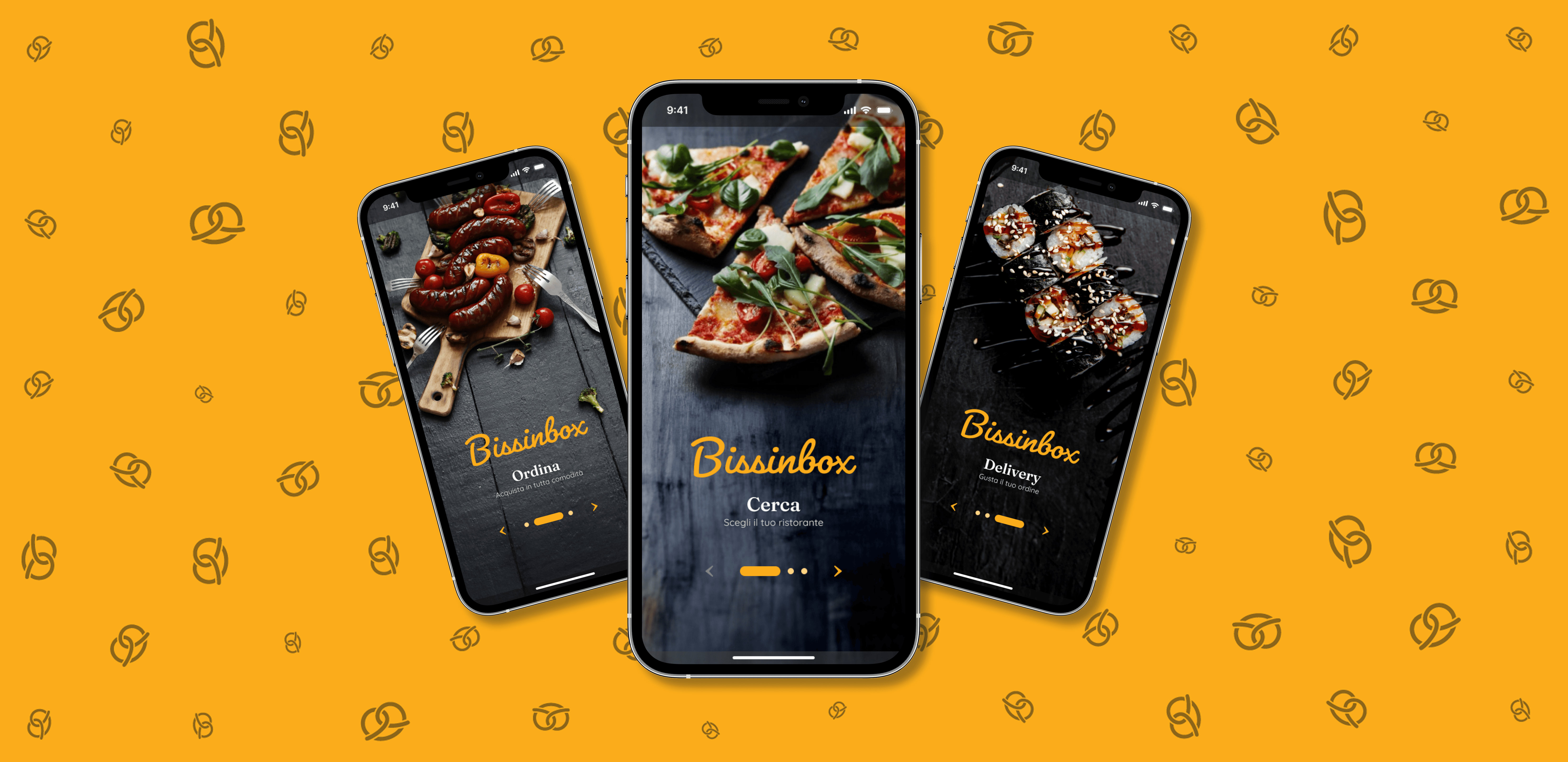
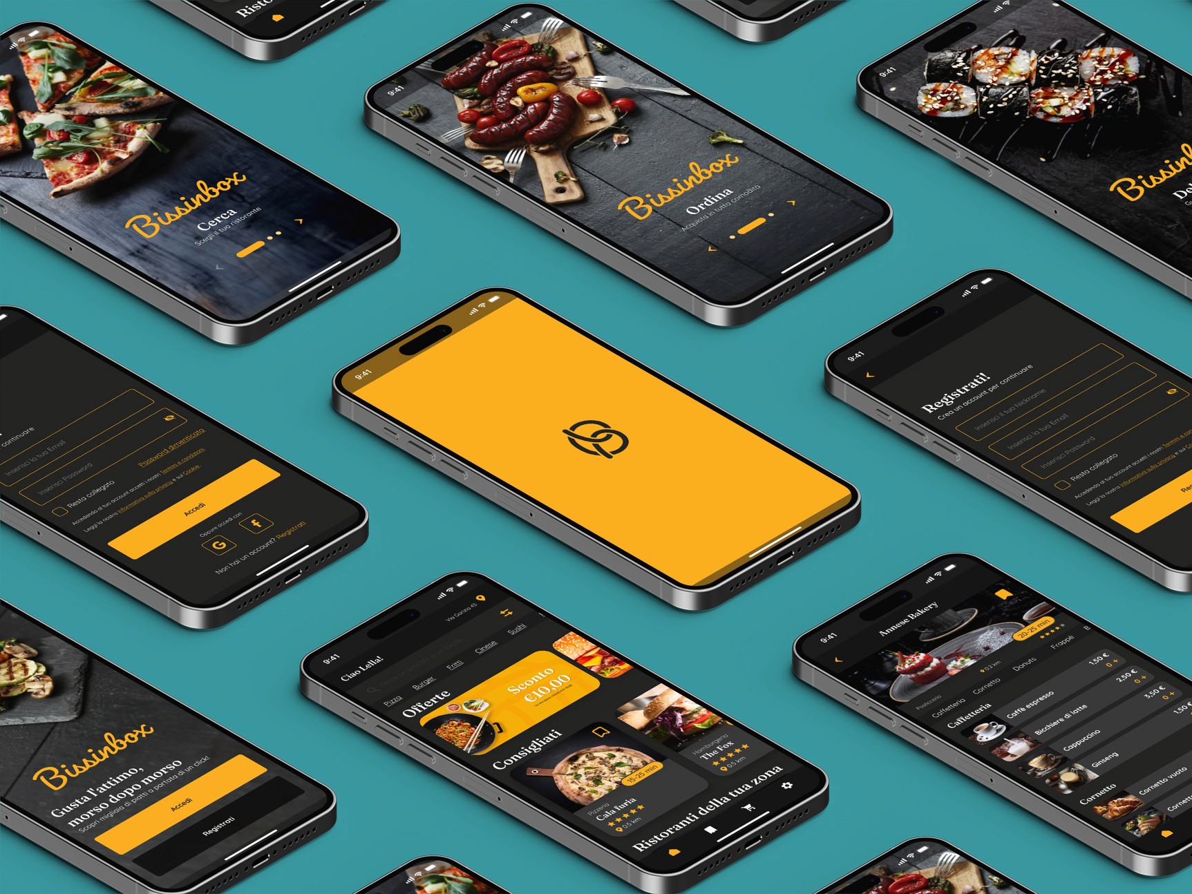
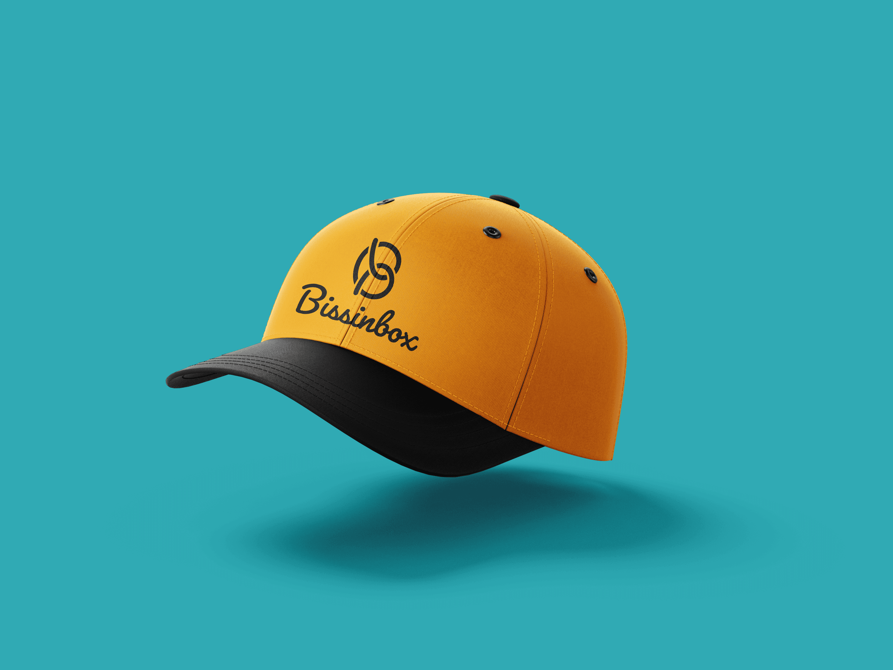
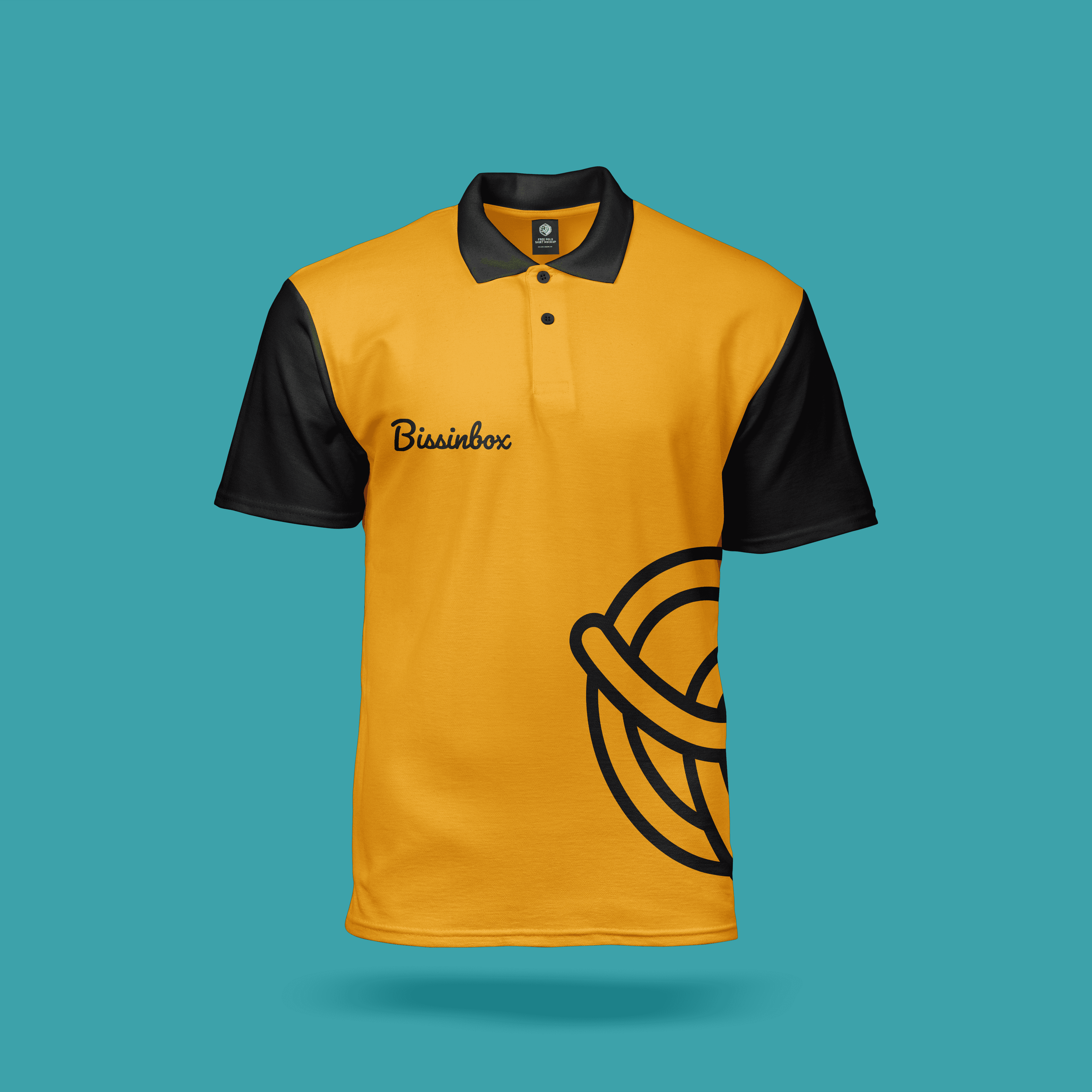
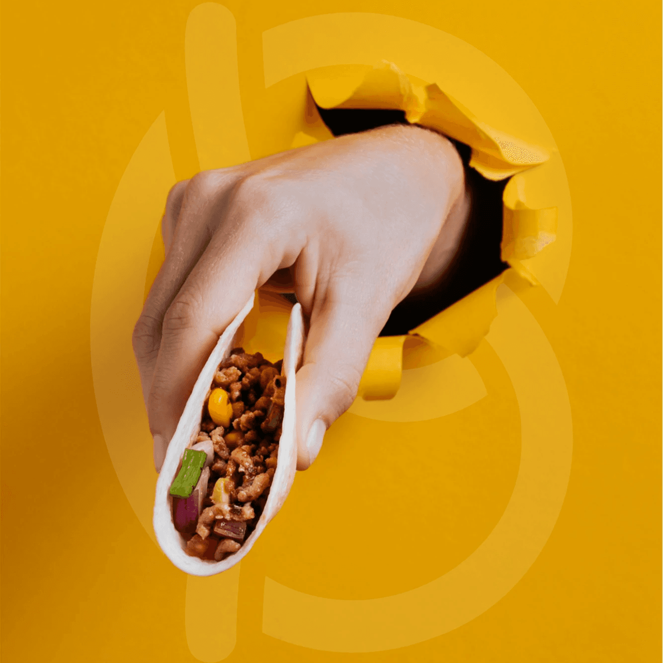
Bissinbox is more than a brand, it’s a coherent visual system that combines naming, identity, and digital design. A project created to convey trust, innovation, and accessibility, turning food delivery into a recognizable and memorable experience. Beyond appearance, every design choice was driven by the goal of building a functional ecosystem that ensures consistency across every touchpoint.
Commercial spot - Controller
The project aimed to create a commercial spot dedicated to a limited-edition controller. The product design integrates the videogame’s logo directly onto the shell, turning it into a distinctive feature. The spot was conceived to highlight every aesthetic and functional detail of the controller, showcasing its build quality and visual impact.

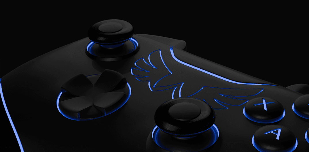
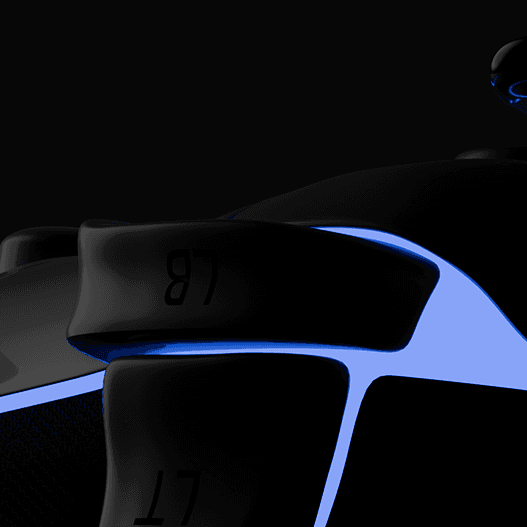
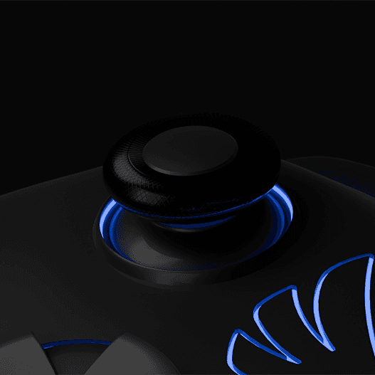
The controller was fully modeled in 3D, with particular attention to the accurate reproduction of every structural and functional detail, including the shell, A-B-X-Y buttons, directional pad, rear triggers, and analog sticks. Great care was devoted to the definition of ergonomic shapes and to the texturing process, in order to ensure a sense of realism and the impression of a solid, high-performance grip.
Renders highlight the complexity of the textures that enhance the grip's ergonomics and the glossy surfaces of the buttons, conveying realism and attention to detail.
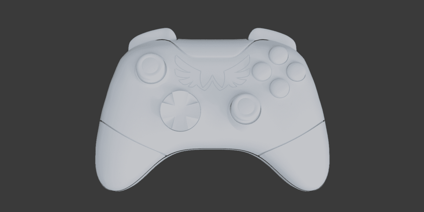
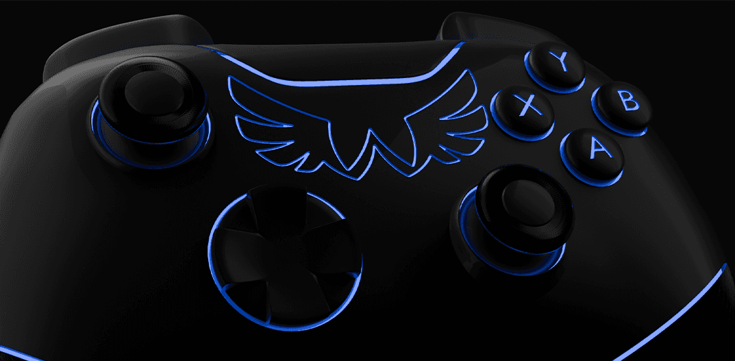
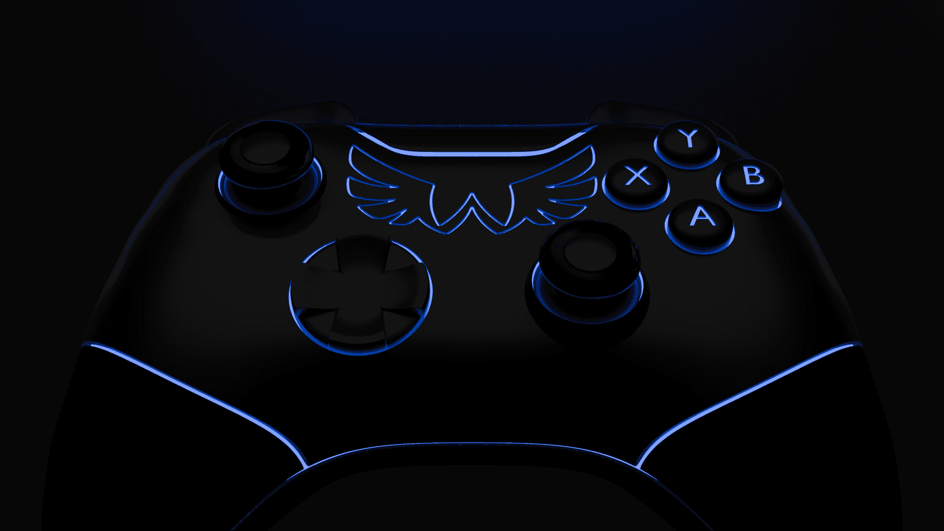
The creation of the storyboard was an essential
step in transforming the initial concept into a cinematic visual language. Through sketches and graphic sequences, the framing, camera movements, and key moments of the animation were carefully planned. Each scene was designed to ensure narrative consistency and visual fluidity throughout the production.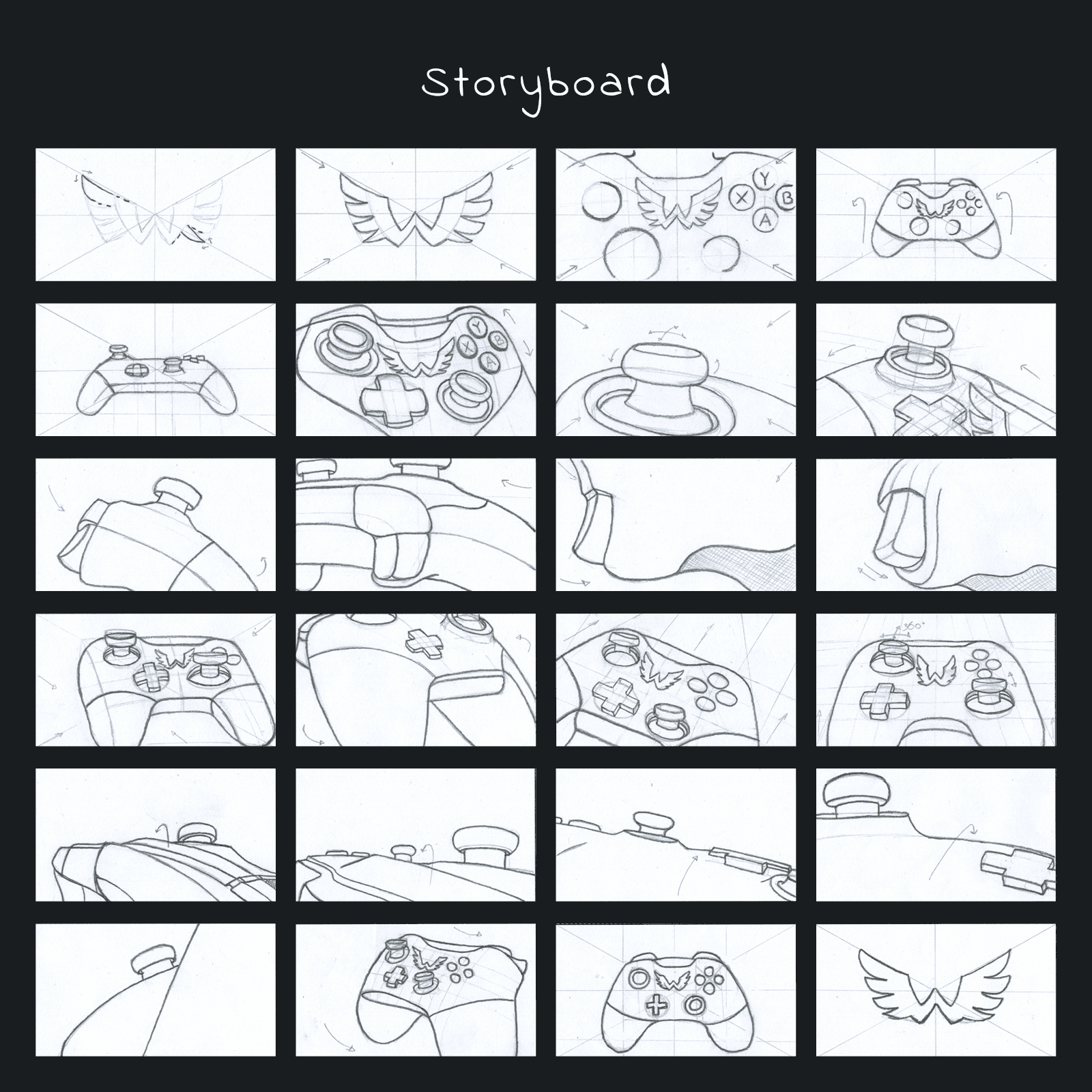
The spot unfolds as a visual journey that reveals the product’s design and technical features using dynamic shots, close-ups, and light effects
that convey energy and speed.
These were just some of my jobs
If you liked them and have a project in mind
These were just some of my jobs
If you liked them and have a project in mind

Raffaelina Cassa
Graphic Designer
Manfredonia, Puglia, IT
+39 389 9876 177
lellacassa.gd@gmail.com
Raffaelina Cassa
Graphic Designer
Manfredonia, Puglia, IT
+39 389 9876 177
lellacassa.gd@gmail.com
Download CV
Download CV
Raffaelina Cassa
Graphic Designer
Manfredonia, Puglia, IT
+39 389 9876 177
lellacassa.gd@gmail.com
Download CV